Here is my final video after having received feedback from my first attempt. The differences are that there is more use of the GoPro angles on the guitar and the filter "mojo". I was very happy with the outcome.
A2 Media
Saturday 21 April 2012
Thursday 1 March 2012
Ancillary Tasks
DigiPak:- Ed Sheeran's 'Take 5'
Booklet
Poster
Colour or B&W?
In my opinion, the black and white poster is more effective however in order to keep my actor from fading into the background, I boosted the black and white effect by increasing the contrast in photoshop
Evaluation
Question 1
In what ways does your media product use, develop or challenge forms and conventions of real media products?
Poster
Digi-pak
Music Video
In order to answer this question for my A2 music video, I have created a three minute video comparing it to real music videos which I researched and how theories of Goodwin have been applied.
Question 2
How effective is the combination of your main product and ancillary texts?
Question 3
What have you learned from audience feedback?
In order to gain feedback for my ancillary we tasks, after everyone in the class had finished, we had a class feedback session. During this session we looked at everyones Posters and Digi-paks and uploaded 'constructive criticism' to the A2 wiki that had been created especially for this role. This wiki allowed us to see what feedback our projects received which we could then use to better our first draft ancillary tasks. The feedback for my poster was very positive, however there were a few disputes about whether it should have been in colour or B&W.
As for my Digi-pak first draft, the feedback was not as popular than that of my poster as it was not realistic for an album of the acoustic/indie genre.
Final Digi-Pak
The feedback for my second Digi-Pak was a lot more positive as the disc was more interesting to look at, the front cover was more conventional and the back cover was more effective in the sense of contrast in colours of fonts and background.
Audience feedback was therefore extremely helpful in the construction of my Digi-Pak because it has definitely improved on its outcome giving the product a more themed style which works well with my poster and my music video.
Question 4
How did you use media technologies in the construction and research, planning and evaluation stages?
In what ways does your media product use, develop or challenge forms and conventions of real media products?
Poster
Digi-pak
Music Video
In order to answer this question for my A2 music video, I have created a three minute video comparing it to real music videos which I researched and how theories of Goodwin have been applied.
Question 2
How effective is the combination of your main product and ancillary texts?
Question 3
What have you learned from audience feedback?
In order to get generalised feedback, I used the social networking site 'facebook' to broadcast my A2 music video, to get a feel for its popularity and whether there were any major issues.
The screenshot above of my facebook post shows that it was received fairly well.
In order to gain feedback for my ancillary we tasks, after everyone in the class had finished, we had a class feedback session. During this session we looked at everyones Posters and Digi-paks and uploaded 'constructive criticism' to the A2 wiki that had been created especially for this role. This wiki allowed us to see what feedback our projects received which we could then use to better our first draft ancillary tasks. The feedback for my poster was very positive, however there were a few disputes about whether it should have been in colour or B&W.
As for my Digi-pak first draft, the feedback was not as popular than that of my poster as it was not realistic for an album of the acoustic/indie genre.
First Attempt
I therefore changed details within my product to make it more popular. As you can see I have changed not necessarily the images but their arrangement. I recreated my front cover to make it more conventional. I was heavily influenced by famous album covers such as John Butler Trio's 'Sunrise Over Sea' below.
I also felt the need, because of my feedback to change my disc as a lot of the feedback confirmed that the original appearance was lacking and fairly dull. This was the reason why I changed the image but I reused the photo that was originally the front cover as I liked it and felt that it fitted well as a disc as the dark areas of the image created strong contrast for the font that I used making the name of the album stand out.
The feedback for my second Digi-Pak was a lot more positive as the disc was more interesting to look at, the front cover was more conventional and the back cover was more effective in the sense of contrast in colours of fonts and background.
Audience feedback was therefore extremely helpful in the construction of my Digi-Pak because it has definitely improved on its outcome giving the product a more themed style which works well with my poster and my music video.
Question 4
How did you use media technologies in the construction and research, planning and evaluation stages?
Contruction
Music Video first attempt
This is my first attempt of my A2 music video. From doing this, I can receive feedback and make alterations to therefore finish a higher quality final product.
Digi-Pak
First Attempt
Conventions of a real media product were equally important in the construction of the my digipak as they were in the construction of my poster how they differ in the sense that rather than advertising another product, they are used to provide information about the product for the consumer such as the use of the 'parent advisory tag' and a front cover sticker telling the consumer what is included in the album for example 'includes hit single ........'. I feel that the addition of these aspects heavily contribute to a higher quality product.
Final Digi-Pak
Conventions of a real media product
Although the Parental Advisory tag is not an aspect of every album, it is very common for a lot of albums. This therefore acts as a convention on my Digi-pak as it makes my product appear more as a real media product.
This is my album tag giving information on the album contents. This is a very common convention which therefore makes my product appear more as a real media product would.
The front cover image below shows where the tag is situated on my digi-pak.
The use of the same font and similar colours make it a suitable aspect as well as being easy to view. The size of the font was also something important as the difference in the song name and 'includes the hit single' help to emphasise the larger font, which is the name of the song for my music video.
For example, as an album is sold, it is necessary that the product has barcode. It acts as an aspect that makes the product more realistic.
As well as this, there are music company logos that help to create the same effect.
There is also the conventional use of fonts in a digipak. This can be found on the front of the front of the disc around the edge and on the bottom of the back cover.
Another convention which can be found on the front of the disc is the 'compact disc' template.
Inside Booklet
Another aspect of an album is that they include a booklet. Therefore, again using in design, I created a 6 page booklet template and input images from my photoshoots with my actor and then added wording that was conventional to an album. This included the lyrics to the song of my music video, a thank you message from the 'artist' to the consumer, more images relevant to my video and information about how the artist became famous.
Mock posters for my ancillary task
After receiving feedback from classmates and tutors, it is clear that this poster was most popular, however, there are alterations which I shall do such as increasing the size of the album picture, given that the album is what is being advertised.
Issues with this mock poster was that the use of the brushes made the image too dark and the photo is not conventional for a music poster as the artist's face is not very easy to see. The album was also too small and did not really stand out which was an issue as it is supposed to be the subject of the poster.
This is the same problem for the following mock posters. The photographs are not successful as the artist's face is not visible and the album cover's are too small.

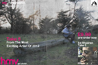
In order to get an idea of what I wanted my final poster be like, I created a number of mock posters using InDesign and Photoshop to input aspects of a conventional and real media product such as the HMV logo (font and dog), as well as phrases such as 'an album from the most exciting new artist of 2012' etc.
The use of industry standard such as photoshop was very effective for creating effects on different layers, for example, using brushes which I downloaded off 'www.brusheezy' such as 'old paper' which was a brush which I used in the majority of my mock ups.
The top poster is the most successful in my opinion and is likely to be the one that I shall use. However, after receiving feedback, there are a few alterations which I need to make such as the size of the album.
The top poster is the most successful in my opinion and is likely to be the one that I shall use. However, after receiving feedback, there are a few alterations which I need to make such as the size of the album.

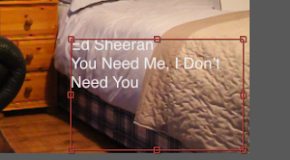
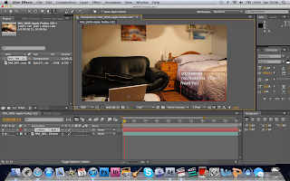
A very important aspect of a music video is the introduction which, in a real media product, contains fonts explaining information about the video about to be seen. Therefore, using after effects, I input fonts into the first shot of my music video using simple but effective transitions such as cross dissolves which I feel accounts for an easier viewing experience.

Here is my construction footage showing how and where I filmed my project. I did this with the use of a GoPro.
Equipment Use
Sunday 26 February 2012
Contact Sheets
In order to create my digi-pak and poster, I took photos of my actor at the locations I used whilst playing the guitar/singing.
These screenshots below show the images I took. After selecting the photos I want to use, I will use Photoshop to create effects that are effective and complementary to the genre of music of my video.
Here are some examples of the edited images that I may use.
Friday 20 January 2012
Tuesday 3 January 2012
Subscribe to:
Posts (Atom)


